
Ubcodes
Responsive Design Made Easy: Exploring Media Queries and Website Testing
A Glimpse of Media Queries
Media queries are a key feature of responsive design. It allows us to cast specific styles for different devices and screen sizes. It's like having a wardrobe that automatically changes your outfit depending on where you're going!
Using media queries we can adapt the layout, typography, and other design elements to create a more optimal user experience across a variety of devices.
How do media queries work?
Media queries check the device's screen size and apply different styles based on that size. It's like telling the browser, " When the screen is this big or that big, do this, or make an element look like this".
We do that by defining breakpoints. Breakpoints are specific screen sizes that define what size the styles should change.
Let's practice with this simple example:
Let's start with a simple HTML file
<h1 class="main-heading">Learning Media queries</h1>
Now, we'll dive into CSS and use media queries to make that heading change its style on a smaller screen.
.main-heading {
  font-size: 36px;
}

@media screen and (max-width: 768px) {
  .main-heading {
    font-size: 24px;
    color: blue;
  }
}
In the code above, we initially set the default style to have a font size of 36 pixels.

We can add a media query to make the heading look different when the screen width is less than or equal to 768 pixels. We change the font size inside the media query to 24 pixels, giving it a nice blue color.

What's happening here?🤔
You'd realize that when the screen size is larger than 768 pixels, the default style with a font size of 36 pixels applies. But when the screen size is 768 pixels or smaller, the media query kicks in, and the heading's font size becomes 24 pixels with a cool blue color.
But media queries can do more!
Using media queries with device orientation
Another means by which we can use media queries is to combine conditions to get even more specific.
For example, let's say we want to target screens between 768 and 1024 pixels wide, only in landscape orientation.
Here is the syntax to do that:
@media screen and (min-width: 768px) and (max-width: 1024px) and (orientation: landscape) {
  /* styles for this condition */
}
We tell the browser that "when the screen is between 768 and 1024 pixels wide and it's in landscape mode, let this style happen".
Using media queries to target specific devices.
We can also target specific devices. In this example lets the target iPhone XR is different.
@media only screen and (device-width: 414px) and (device-height: 896px) and (-webkit-device-pixel-ratio: 2) {
  /* styles for iPhone XR */
}
We are trying to say here that when the screen matches the dimensions and pixel ratio of the iPhone XR, apply these styles. It is in similitude with giving a personalized touch to our website just for specific devices.
How to identify and test how your website would appear on different devices.
Identifying and testing various screen sizes is an important part of responsive web design. Here, I would list ways we can ensure consistent and optimal user experience.
These are a few approaches to identifying and testing screen sizes
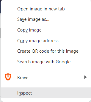
1. Browser Developer Tools: Developer tools are an effective feature of modern web browsers. It offers a responsive design mode. To access these tools, simply right-click on a web page and select "Inspect" from the menu that pops up. You could also use F12, which is the keyboard shortcut.

Once you're in the Developer Tools, you'll find a little icon that looks like a smartphone or a tablet, usually located in the top bar. Clicking on that icon unleashes the power of the device toolbar or responsive design mode. It's like having a virtual device right there on your screen😉.
You can toggle through different device options and see how your website adapts to various screen sizes. You can choose from popular device presets or even customize the screen dimensions to test specific sizes.
You can also take note of the different screen sizes and implement them in your CSS code.
As you switch between different screen sizes, your website will transform, adjusting its layout, fonts, and images to fit the selected screen size.
This responsive design is a nice way to preview how your website will appear on different devices without needing those devices in front of you.
2. Physical Devices: You could also test your website on actual physical devices. I do that by using my developer tools. You can test on smartphones, tablets, laptops, desktops, and other devices. Ensure you cover a range of screen sizes, resolutions, and orientations. This way you have valuable insights into the real-world experience of your website.
3. Online Screen Resolution Testers: There are also online tools available that allow you to enter a URL and see how it renders on different screen sizes. These tools simulate the appearance of your website on various devices and resolutions. Some popular screen resolution testers I'd recommend areBrowserStack, Responsinator, and Am I Responsive.
4. User Agent Switchers: You could also make use of web browser extensions or plugins like User-Agent Switchers can modify your browser's user agent, making it appear as if you are accessing the website from different devices or browsers. This can help test how your website responds to different user agents, which may affect the layout and functionality.
5. Analytics and User Feedback: Analyzing website analytics can provide insights into the devices and screen sizes commonly used by your visitors. I also use analytics for this blog. This data can help you prioritize testing on specific screen sizes. Additionally, gathering feedback from users who access your website on different devices can give you valuable insights into any usability or display issues.
Navigating the Realm of Responsive Design: Lessons Learned from My Journey 🙈
During the development of my blog, I made sure to test it extensively using my browser's developer tools. Throughout this process, I encountered a specific issue with phone sizes resembling the Galaxy Fold. Unfortunately, the responsiveness, particularlyabouto the footer, was not up to par. Admittedly, I was feeling a bit lazy at that point, given the exhaustion from working on the entire blog. Moreover, I couldn't understand why anyone would opt for such a tiny phone like the Galaxy Fold.
However, my perspective shifted when I realized that in the environment where I study, quite a few individuals use iPods. It became evident that I needed to address this issue. It was a valuable lesson in considering the diverse range of devices that people use to access websites.
It taught me the importance of not only testing my website extensively but also understanding the preferences and habits of the target audience. It's remarkable how a small shift in perspective can lead to significant improvements in web development.
To sum it up...
- We can see that media query is pretty powerful. It allows us to apply different styles based on screen sizes.
- Testing responsiveness is crucial to ensure a seamless user experience.
- Use browser developer tools, physical devices, and online testers to test your website across various screen sizes.
- Consider factors like layout, font sizes, image optimization, and performance to create a responsive design that adapts beautifully to different devices.

Ubcodes
Hi there, I am Etop-Essien Emmanuella Ubokabasi. Welcome to my blog, where I share my insights and tips on web development, mental health, and books. Whether you are a beginner or an expert, a reader or a writer, a coder or a therapist, you will find something useful and interesting here. I am passionate about web development and drumming with a keen interest in topics related to mental health, books, and knowledge. As a developer, I share insightful topics, development tips, and tutorials to inspire personal growth and empower others to grow in their careers. With a desire to be and make a positive impact, I enjoy exploring ways to promote positive mental health, discussing books, and sharing knowledge with others. I hope to inspire you to pursue your passions, learn new things, and care for your mental health.
